
Angular 6 Elements
Angular Elements library provides a method to extend the HTML tag library writing components that can be used with any framework. The new components can be used everywhere without any Angular knowledge and regardless the technology used to implement a web site:
- CMS
- HTML and VanillaJS
- React, Vue, etc
- legacy AngularJS application as an alternative to
ngUpdatefor the migration.
Angular Elements project has been revealed at the AngularConnect 2017 by Rob Worlmald
Here's the slides from my Angular Elements talk @ #AngularConnect - https://t.co/4kuySZ9zMs
— Rob Wormald (@robwormald) November 8, 2017
Presentation. A presentation about Angular Elements based on this post is also available.
World of Custom Components
Want to know the syntax difference between native Web Components, @polymer, @stenciljs and @Angular Elements? I created a repo that implements the same Todo list with those technologies
— Julien Renaux 👨💻 (@julienrenaux) January 29, 2018
Repo: https://t.co/dWlM4Hsz4P
Demo: https://t.co/5eo8NrxZQb#TodoMVC pic.twitter.com/RMoNQOuBmV
Each framework provides a specific tailored mechanism to smoothly extend the HTML tag library w.r.t. its own way to configure, interact and update the DOM element.
For instance in AngularJS, the developer can implement new HTML tags via the directive approach: a powerful technique to link together a controller and a template encapsulating everything in a new DOM element.
Framework specific components libraries cannot be used neither by another framework nor in a CMS nor in a website implemented in HTML and JavaScript with standard Web API.
Nitty Gritty. Web Components allow to extend the HTML developing new cross browser DOM elements. Encapsulation and private features enpower reusability avoiding collision with other elements (Shadow DOM).
Web Components
Web components are a set of Web Platform APIs to create new custom, reusable, encapsulated HTML tags that can be used everywhere.
Developers can then extend HTML tag library writing new elements that encapsule style and behavior.
Web Components include four different technologies:
- Custom Elements: JavaScript APIs to define new DOM elements.
- Shodow DOM: JavaScript APIs to render and attach and encapsulated Shadow DOM tree to an element whose features stay private and not collide with the rest of the document.
- HTML templates: write HTML templates that can be reused by custom elements using
<template>and<slot>tags. - HTML Imports: how to include and reuse HTML templates.
Pro Tip. Angular Elements are powered by Custom Elements.
Watch out. Web Components specification has moved from V0 to V1.
Extend the HTML with v1 Custom Elements
Let’s introduce an example to show how to implement a new custom element.
Custom Element. Web API that allow to extend the HTML tag system creating new custom DOM elements that encapsulate functinalities away from the rest of the code. It refers to encapsulation principle of the software engineering.
To define a new v1 Custom Element:
- create a ES6 class extending
HTMLElement; - register the new class with the browser via the
CustomElementRegistryWeb API: use [window.customElements] property of theWindowinterface to get an instance of it; - use lifecycle hooks or reactions
constructor: initialize the state, set up event listeners or create a Shadow DOMconnectedCallback: called when the element is attached to the DOM, useful for setting up, fetching some resources or renderingdisconnectedCallback: called when the element is removed from the DOM, useful for cleaning upattributeChangedCallback(attrName, oldVal, newVal): called when an attribute registered in theobservedAttributesproperty has been added, removed, updated or replacedadoptedCallback(): called when the element has been moved into a newdocument(document.adoptNode(el))- more examples
- events can be associated, as any other DOM element, using
EventTargetmethodaddEventListener.
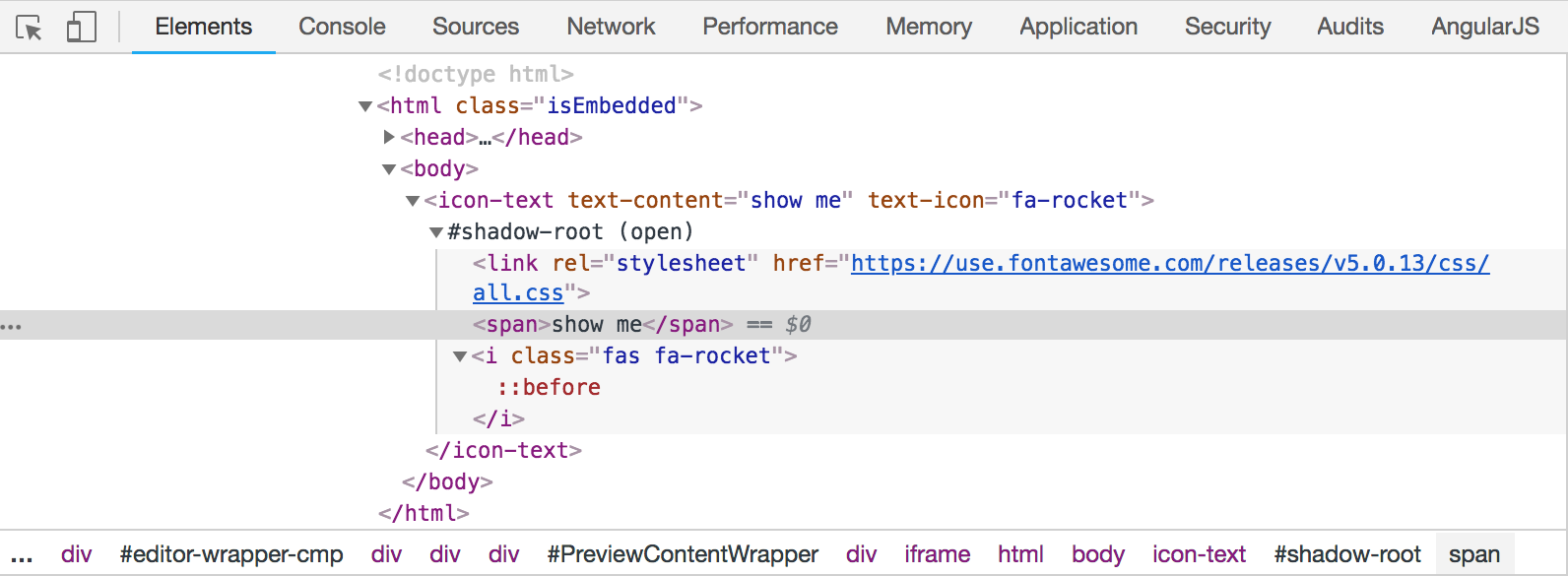
Shadow DOM
Shadow DOM is more or less like a scoped subtree inside the Custom Element that helps to build a new DOM element.
class RocketParagraph extends HTMLElement {
  constructor() {

    super()

    const shadowRoot = this.attachShadow({ mode: 'open' })
    shadowRoot.innerHTML = `<link rel="stylesheet" href="fontawesome.com/all.css">`

    const span = document.createElement('span')
    const icon = document.createElement('i')

    ...

    shadowRoot.appendChild(span)
    shadowRoot.appendChild(icon)
  }
}
window.customElements.define('rocket-paragraph', RocketParagraph)
A Shadow Root is the document fragment that gets attached to a “host” element. The act of attaching a shadow root is how the element gains its shadow DOM.
Building Libraries
There are many libraries that help to build custom Web Components providing features such as:
- boilerplate to define the project scaffolding
- Polymer Boilerplate
- ValillaJS Boilerplate
- etc
- polyfills to have web components work in all major browsers
- automatic build systems
- Yeoman generator to automate scaffolding and building web components.
- Polymer CLI to automate scaffolding and build Polymer-based web components.
Once created the component it can be published and the downloaded and installed via a package manager like Bower.
Look for a component, for instance emoji-rain, install and use it in your web site.
More examples are available on the Web Components Github MDN repo.
Angular Elements
Angular Component on the inside, standards on the outside. Rob Wormald
Pro Tip. Angular Elements are Angular Components packed as Custom Elements, part of the Web Components, a suite of Web platform APIs.
Angular Components act as a hosts for Custom Elements mapping properties from the Angular world to the Web Platform API standard:
@Inputmapped to properties@Outputmapped to events@HostBindingmapped to observed attributes- lifecycle hooks mapped to Custom Elements lifecycle hooks
Whereas Inputs rely on the Custom Elements lifecycle hook, Outputs rely on the Custom Event API (spec). Both APIs are entirely separate from each other.
Pro Tip. Angular Elements are self-bootstrapping, they host an Angular Component inside a Custom Element and their usage is not anymore tied to a specific framework.
Dependency Injection. Angular Elements also let us take advantage of Angular’s dependency injection. When we create a custom element using Angular Elements, we pass in a reference to the current module’s injector. This injector lets us share context across multiple elements or use shared services.
Content Projection. We also get content projection (transclusion) with Angular Elements, but not with dynamic content projection yet. Content projection we’ll have the ability to use slots and the shadow DOM as browser support increases.
PR for basic Shadow DOM v1 support in Angular - should make Elements more flexible, as you can now use <slot> elements to do basic content projection. https://t.co/SBwNBQmwwe
— Rob Wormald (@robwormald) June 30, 2018
Angular Elements: not production ready yet
Angular Elements is one of the Angular Labs projects where new experimental ideas are developed. The first release became part of Angular 6 and a more refined version should arrive along with Angular 7. For the time being Angular Elements is not ready for production yet:
- element bundle size: even if a small widget is delivered a great amount of Angular code comes along with. Angular Yvi, next Angular compiler generation, should solve this problem removing from the bundle unused Angular code;
- laborius setup: the set up required to use Angular Elements is a bit cumbersome, better way should come;
- browser support: native browser support for Custom Elements has been not fully implemented everywhere as can be seen from this table. For the time being:
- Chrome 54 has Custome Elements v1;
- Safari 10.1 has Custom Elements v1;
- Edge has begun prototyping;
- Mozilla has an open bug to implement;
- use
@webcomponents/webcomponentsjsloader to asynchronously load only the necessary polyfills required by the browser.
Angular Elements In Action
The code used in this post is available on GitHub. Following all the steps to reproduce the full workflow if you start from scratch.
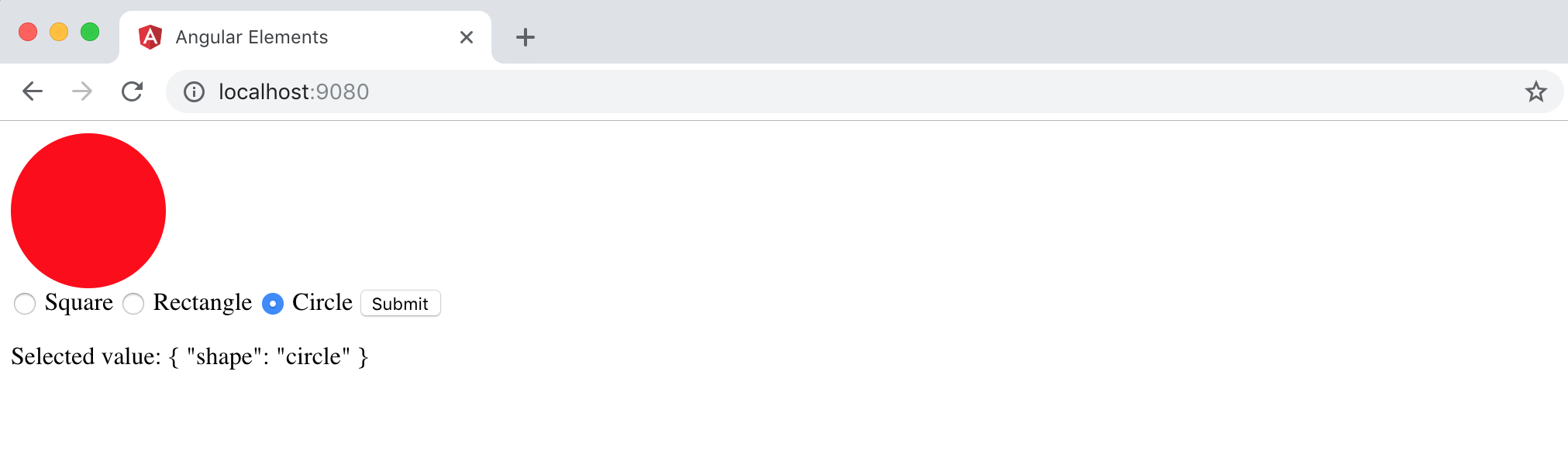
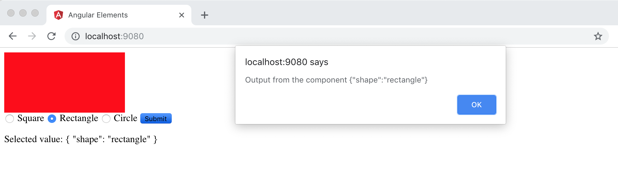
Angular Elements Component Description
The Angular Elements component will allow the user to select a CSS shape and, once the button will be pressed, an alert message will be displayed with the info of the selection made.
The goal is to show how the input/output between an Angular Elements component and the vanilla JavaScript of the hosting page works. Basically the selection is captured by the component, the action connected with the submit button generates an event that communicate the selection made by the user to the external world.
Setup the Project
npm install -g @angular/cli@latest
ng new angular-geometry-elements
cd angular-geometry-elements
ng add @angular/elements --project=angular-geometry-elements
The latest command add both Angular Elements and the polyfill called document-register-element to the configuration file angular.json.
Create the Component
Open and modify the file app.component.ts as follows:
import { Component, ViewEncapsulation, Input, Output, EventEmitter, OnInit } from '@angular/core';
import { FormControl, FormGroup } from '@angular/forms';

@Component({
  selector: 'app-root',
  templateUrl: './app.component.html',
  styleUrls: ['./app.component.css'],
  encapsulation: ViewEncapsulation.Native
})
export class AppComponent implements OnInit {

  @Input() defaultValue = 'square';

  @Output() selectedValue = new EventEmitter<string>();

  form: FormGroup;

  ngOnInit(): void {
    this.form = new FormGroup({
      shape: new FormControl(this.defaultValue)
    });
  }

  submit() {
    this.selectedValue.emit(this.form.value);
  }
}
ViewEncapulation: change the encapsulation strategy w.r.t. the styles are applied to the component:Native: use the real Shadow DOM if natively available, otherwise theweb-componentspolyfills are required to shim the behavior.Emulated: scoped styling emulating the Shadow DOM.
@Inputfor a property with a default value.- Some other properties.
In the file app.module.ts rename bootstrap to entryComponents to avoid the component bootstrap along with the module:
import { BrowserModule } from '@angular/platform-browser';
import { NgModule, Injector } from '@angular/core';

import { FormsModule, ReactiveFormsModule } from '@angular/forms';

import { createCustomElement } from '@angular/elements';

import { AppComponent } from './app.component';

@NgModule({
  declarations: [
    AppComponent
  ],
  imports: [
    BrowserModule,
    FormsModule,
    ReactiveFormsModule
  ],
  providers: [],
  entryComponents: [AppComponent]
})
export class AppModule {

  // The bridge between Angular and the Web API.
  constructor(private injector: Injector) {
    const el = createCustomElement(AppComponent, {injector});
    customElements.define('geometry-elements', el);
  }

  ngDoBootstrap() {}

}
Now focus on the constructor of the module:
constructor(private injector: Injector) {
  const el = createCustomElement(AppComponent, {injector});
  customElements.define('geometry-elements', el);
}
this function returns a special class that can be used with the Custom Element Web API to define a new custom element as the pair selector and ES6 class.
Pro Tip. The Angular Component now act as a host for the Custom Element.
Build and Pack the Angular Element Component
So fare there is not a straight forward way to pack an Angular Element component, here some approaches proposed by Sam Julien:
- Use a bash script, like in this article by Tomek Sułkowski.
- Use Gulp, like in this made-with-love component by Nitay Neeman.
- Use Manfred Steyer’s CLI tool ngx-build-plus.
- Use Node with a script like in this article by Sebastian Eschweiler.
Following the Sam Julien’s advice the Node approach is choosen:
npm install --save-dev concat fs-extra
Create a file called elements-build.js at the root of the project with the following script:
const fs = require('fs-extra');
const concat = require('concat');

(async function build() {
  const files = [
    './dist/angular-geometry-elements/runtime.js',
    './dist/angular-geometry-elements/polyfills.js',
    './dist/angular-geometry-elements/scripts.js',
    './dist/angular-geometry-elements/main.js'
  ];

  await fs.ensureDir('elements');
  await concat(files, 'elements/geometry-elements.js');
  await fs.copyFile(
    './dist/angular-geometry-elements/styles.css',
    'elements/styles.css'
  );
})();
The script will combine what the Angular CLI has generated in a single file.
In the package.json add
"build:elements": "ng build --prod --output-hashing none && node elements-build.js"
Then create the file index.html in the previously created folder elements to have a page where to test the new created component:
<!doctype html>
<html lang="en">
  <head>
    <meta charset="utf-8">
    <title>Angular Elements</title>
    <base href="/">
    <meta name="viewport" content="width=device-width, initial-scale=1">
    <link rel="icon" type="image/x-icon" href="favicon.ico">
    <link rel="stylesheet" href="styles.css"></head>
  </head>
  <body>
    <geometry-elements id="el" default-value="circle"></geometry-elements>
    <script type="text/javascript" src="geometry-elements.js"></script>
    <script>
      document.getElementById("el").addEventListener("selectedValue", function(value){
        alert("Output from the component " + JSON.stringify(value.detail));
      })
    </script>
  </body>
</html>
Fireup the build
npm run build:elements
The output of the build is put in the elements folder:
.
├── angular-geometry-elements.js
├── index.html
└── styles.css
Note. Style file is empty because of the Native strategy choice.
Test The Angular Elements Component
Install the static-server to serve the elements/index.html
npm install -g static-server
From the afrementioned folder type
static-server
and connect to localhost:9080.
Check The Registered Element
Following this advice, in the browser console type:
String.prototype.wasRegistered = function() {
  switch(document.createElement(this).constructor) {
    case HTMLElement: return false;
    case HTMLUnknownElement: return undefined;
  }
  return true;
}
'element-cake'.wasRegistered()
//⇒ true
'element-my-cake'.wasRegistered()
//⇒ false
'xx'.wasRegistered()
//⇒ undefined
Browser Support
Recent News
Great to hear that! Firefox 63 are getting Shadow DOM and Custom Elements.https://t.co/Hgp7HXx8r5
— Hayato (Shadow DOM) (@shadow_hayato) August 14, 2018
We are planning on deprecate and remove Shadow DOM v0 and Custom Elements v0 from Blink. Shadow DOM v0 and Custom Element v0 are NOT *Web*. They are only available on Google Chrome.
— Hayato (Shadow DOM) (@shadow_hayato) July 11, 2018
If you are still using v0 APIs, please consider to migrate to v1 seriously.
Little hack for enabling shadow DOM V1 and slots in Angular Elements, till we fix https://t.co/Q3F1LoUcGP - https://t.co/vh4TRGbQTP
— Rob Wormald (@robwormald) June 10, 2018